Online shopping today has become more viable than ever. It lets customers tap into new and faraway markets. After the pandemic and social distancing, people get more accustomed to the online market.
This new online selling trend opens a whole new door for new entrepreneurs. It allows them to promote their business and boost their sales at a significantly low cost.
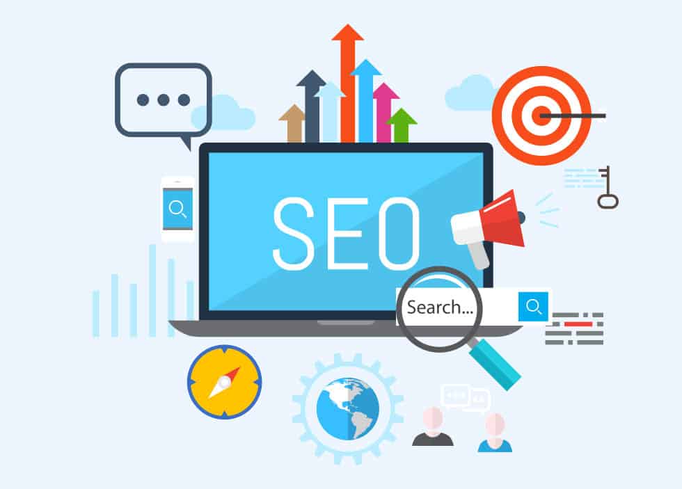
However, you must also remember that every business is now trying to enter online. So, the competition is also higher than ever. Without a proper digital marketing strategy, you can’t stay in the competition for too long.
The first step to launching a successful online store is to ensure that your e-commerce site is professionally designed.
It is easy to make design mistakes if you are new in the business. You can avoid many mistakes if you know the common mistakes people make when they first start to design their websites.

Mistake 1- Give Incomplete Product Information
When you go to a store, you can check the products by yourself. You can read the packaging labels and talk to the sales staff for more information. You can even ask them what should be the best choice for you.
Online shopping is super easy, but unfortunately, you don’t get to interact the way you could in a physical shop. You have to rely on the information that the website provides you.
So, you don’t appreciate it if the product description is too brief and lacks details. That’s why your e-commerce website must provide as many details as possible about the products. Otherwise, people are not going to trust you.
Mistake 2- Complicated Check-out Process
Even with an excellent user-friendly website, you can’t get too far if you have lengthy or complicated check-out process. It can harm your business more than you can even think. Many e-commerce portals fall victim to it. Every year e-commerce businesses lose millions of dollars for abandoning shopping carts.
People are not too patient when they use the internet. They want things to be as easy as possible. Make your check-out process design simple, keep the step minimal and don’t give your customers too much time to change their minds.

Mistake 3-Lack of Responsive Design
People are now relying on smartphones more for browsing the internet. In fact, 51% of adults use mobile phones to buy online. If you don’t make your site responsive, you will lose more than half of your customers.
With responsive design, your site will be mobile-friendly. It will improve how it looks on devices with large and small screens, and increase the number of time visitors spend on your site. It can also help you improve your search engine rankings.
Mistake 4-The absence of a Search Engine
When visitors visit your website, not all of them are in the mood to browse your product galleries. Some visitors would look for some specific products. Do you think they will appreciate it if you force them to go through all of your products?
Not providing a search engine is a grave mistake if you have a lot of products. When people come for a specific product to buy, they may leave your sites without giving a thought.
A good e-commerce portal should have a built-in search engine that allows users to search using keywords to refine their results according to criteria. For example, if someone is looking for shirts, there should be filters such as fabric, size, occasion, etc.
Mistake 5- Poor Product Images
Some e-commerce sites are doing a very poor job when it comes to showcasing product images. They only provide a single low-quality image. Lacking a good quality product image will hurt your sales.
Remember that your customers don’t have any chance to touch the products. They have to rely on the product image to buy the products. They are not going to trust you if you don’t show them enough photos.
The image should be pretty large, clear, and taken from a variety of angles. By showing a consumer how a product looks, they can better understand how it looks.
Mistake 6- Poor Navigation
Shoppers can get very irritated if they don’t understand where to go on the website. Navigating a website shouldn’t feel like navigating through a maze.
Without categorizing your products, the customer will have a hard time finding a particular type of product.
Organize smaller categories into larger ones that are similar, or bunch them together in smaller categories. Shoppers can then easily browse through e-commerce categories and navigate your store.
Our team of developers can create an engaging site for you that is both beautiful and functional. Contact us today with your requirements.