These steps will help you understand how to build a successful page using Elementor if you are a new user.
Creating A New WordPress Page
- Click Pages > Add New in the WordPress dashboard.
- Give your page a name.
- You can set the visibility options for the page if it should be kept private, by clicking the Publish button.
- Enter the Elementor Web Builder by clicking Edit with Elementor.
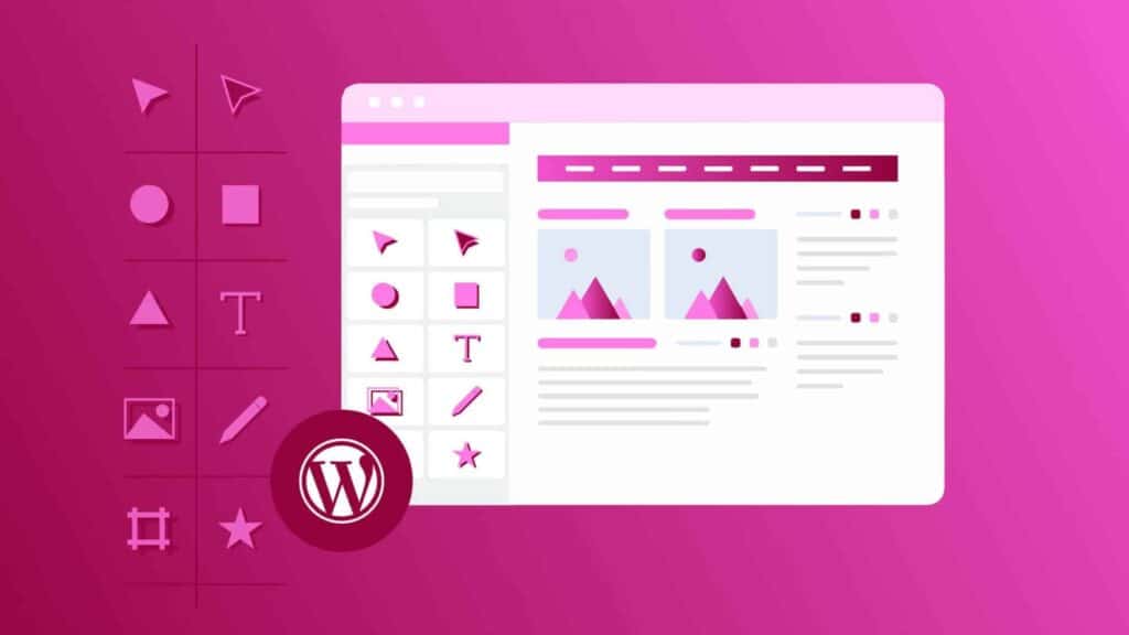
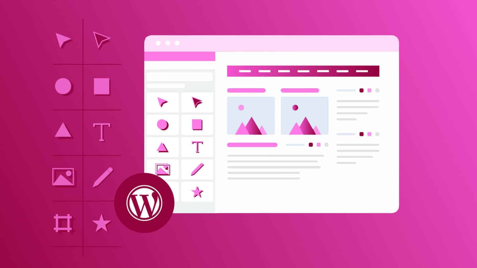
Edit Your First Page
The building blocks of Elementor are Sections, Columns, and Widgets. A Section consists of a number of Columns, and within them there are still more Columns. The Widgets are located in Columns inside Sections. These widgets are placed within Columns. Sections, columns, and widgets are controlled by their handles. Hovering over an element’s edit button will display editing handles when you click the Preferences tab. Clicking No will hide them.
Editing
By right clicking the handle of a Section, Column, or Widget, you can edit them.
Sections
- You can add a Section by clicking the + icon, or choose a pre-designed Page or Block from our library by clicking the folder icon.
- Configure your Column structure.
- You can edit, duplicate, copy, delete, etc., by right-clicking.
- You can add, drag, or delete sections with the Section handle.
Columns
- Select the Columns Width. If you want to rearrange the columns, either drag a dashed line between the columns or go to Layout.
- You can add more columns by right clicking and selecting Add New Column.
Widgets
- Add widgets to your columns.
- By default, the Widget’s width is determined by the Column’s width. By selecting the Advanced tab > Positioning you can access additional width options.
Copy or Delete all content
Simply right click on the empty section to add a section and the templates icons and select Copy or Delete to remove all content from the page. Additionally, you may paste items onto another page on the same website.
Adding templates
Using a template, you can easily insert a pre-built Page or Block into any page within seconds.
- Click the folder icon from the editing screen.
- You can preview a template by clicking the magnifying glass icon in the library of templates.
- Choose the template you want to insert by clicking INSERT.
- Your favorite templates may also be saved to My Favorites by giving them a heart.
- Have you downloaded a template from somewhere else that you would like to use? The .json or .zip file can be uploaded by clicking the up arrow in the upper right corner.
Mobile responsive editing
There are settings available for Mobile, Tablet, and Desktop. Text size, margins, padding, and margin-padding of elements are the most common uses.
- You can control an individual element by clicking the Viewport Icon next to it.
- To edit a device’s settings, click on the device’s icon.
Controlling responsive background images and borders
Several options are available for adjusting the background images for each device in Elementor, which is automatically device-responsive.
- For each device, you can select a different background image, whether it is a smaller version of a larger image or a completely different image altogether.
- There are different options for selecting background image size, position, attachment, and repeat for each device.By doing this, you can choose which area of the image will be displayed on different devices.
Visibility
The device will determine which sections are visible / hidden.
- Select Section Setting > Advanced > Responsive.
- Depending on your preference, you can choose to hide on desktop, hide on tablet, or hide on mobile.
Whenever you hide an element and go back to the view it is hidden in, the element is “muted”. As a result, you are clearly aware that this element will not appear on the live site, but you can continue to edit it as needed.
In the responsive mode, that specific area can be edited, even if it is hidden. The element will be editable in the mobile view, even if it is hidden on desktop and tablet.
Change mobile & Tablet breakpoints
Setting breakpoint values for mobiles and tablets is also possible.
- To set the mobile and tablet breakpoints, click the hamburger menu in the upper left corner of any Elementor page or post editor and choose Site Settings > Layout > Breakpoints.
- Don’t forget to save.
- Click the Regenerate CSS button in Elementor > Tools > General Tab > Regenerate CSS.
Columns ordering
By using this feature, you can reverse the order of columns.
In the Section Setting page, go to Advanced > Responsive > Reverse Columns and select Yes.
Device preview
At the bottom of the panel, click the responsive editing icon to switch between devices. Previews for each device appear at the top of the editor.
Publish your page after previewing it
Your page is ready to be published after you have finished designing it. Scroll down to the bottom panel:
- Click on the preview icon to preview.
- Go ahead and click the publish button when you’re satisfied with the result.
- View the published page by clicking ‘Have a Look’.
Please not: There is a difference between the Preview link and the actual page link.
Save as a Draft
Editing a Published page in Elementor allows you to save your work as a Draft. By saving your work as Draft, your published page will not be ruined.
- Select Update / Publish by clicking the arrow.
- Select Save Draft.